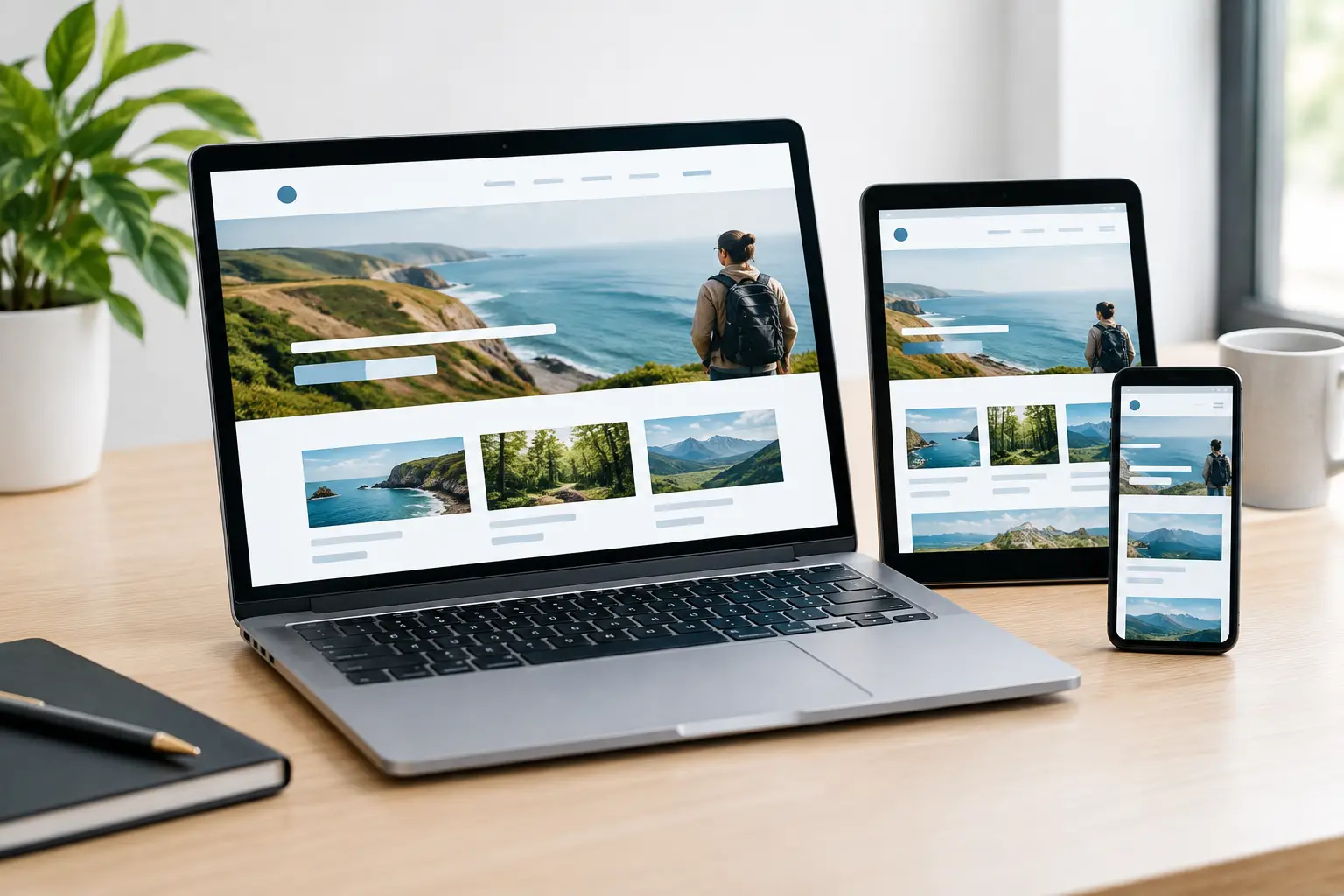
A potential customer finds your business on Google, taps your website from their phone, and gets a tiny menu, slow-loading images, or a contact form that is difficult to complete. That lead may not wait for a fix. They will likely call the next business in the results. A mobile responsive website redesign addresses that moment, turning mobile traffic into calls, form inquiries, booked appointments, and revenue.
For local service businesses, mobile is often where the buying decision happens. People search when they need a plumber, contractor, attorney, clinic, restaurant, or home service provider nearby. Your website must make the next step obvious, fast, and credible.
Why Mobile Performance Is a Growth Issue
A website can look acceptable on a desktop computer and still underperform badly on a phone. Desktop visitors may have more patience, a larger screen, and a keyboard. Mobile visitors are usually moving quickly. They want an answer, proof that you serve their area, and a clear way to contact you.
That means responsive design is not simply about shrinking a desktop layout to fit a smaller screen. It is about prioritizing what matters most when a prospect has limited time and attention. Your phone number, service area, primary services, customer proof, and call to action should be easy to find without pinching, zooming, or hunting through crowded navigation.
When mobile experience falls short, the impact reaches beyond web design. Paid ads send expensive clicks to pages that do not convert. Local SEO brings visibility without enough calls. Social media content creates interest that disappears at the point of inquiry. A stronger site gives every acquisition channel a better place to send prospects.
What a Mobile Responsive Website Redesign Should Fix
A redesign should solve business problems, not just replace old colors or add a newer template. Before changing the visual direction, assess where users drop off, which pages generate leads, how quickly key pages load, and whether the site supports your sales process.
Navigation and contact paths
On mobile, navigation needs to be short and intentional. A visitor should be able to reach core services, locations, reviews, and contact options in a few taps. Persistent call buttons can work well for urgent service businesses, while appointment-based companies may prioritize a simple booking path.
The right choice depends on how customers buy. An emergency restoration company benefits from a prominent click-to-call action. A B2B consulting firm may need a stronger case-study path before asking for a consultation. Good UX follows the customer journey rather than copying another company’s layout.
Page speed and Core Web Vitals
Slow pages cost attention and trust. Large image files, unnecessary scripts, autoplay video, old plugins, and poorly configured hosting can all create frustrating load times. A redesign is an opportunity to clean up the technical foundation, optimize media, and build pages that work efficiently on real mobile connections.
Speed improvements should be measured, not assumed. Core Web Vitals, page load behavior, form performance, and user engagement data help show whether the new site is doing its job. A visually impressive homepage is not enough if it delays the visitor from seeing the information that drives action.
Clear service and location relevance
Local customers want confidence that you provide the service they need in the area where they need it. Each key service should have a focused page with useful copy, relevant visuals, a direct conversion path, and supporting trust signals. If your business serves multiple cities, location strategy needs care as well.
Creating thin pages for every nearby town is not a growth strategy. Strong local pages explain your offering, feature real market relevance, and give users a reason to contact you. This also gives your local SEO, Google Business Profile work, and directory management a stronger website foundation.
Conversion-focused trust signals
Mobile visitors make quick judgments. Prominent reviews, credentials, project photos, client logos, guarantees, before-and-after examples, and clear response expectations can reduce hesitation. The most persuasive proof is specific and relevant to the service being considered.
Avoid stacking every possible badge onto a page. Too much clutter creates uncertainty. Choose the proof that answers the prospect’s biggest question: Can this business solve my problem, serve my location, and respond professionally?
Redesigning for Leads, Not Just a New Look
The best redesign projects begin with targets. Do you need more calls from Google Maps searches? More quote requests from paid traffic? Better-quality inquiries for higher-ticket services? More booked demos from a startup audience? These goals shape the content, page hierarchy, calls to action, tracking, and follow-up process.
A conversion-ready website typically connects several moving parts. Landing pages need to match the message in your ads. Forms need to ask for enough information to qualify leads without becoming a barrier. Analytics need to record the actions that matter, including calls, submissions, booking events, and campaign-driven visits.
This is where an isolated web project can lose momentum. If the redesign team does not understand your SEO priorities, paid media campaigns, branding, or sales workflow, the finished site may look polished but create more work later. One strategy across channels makes it easier to see what is driving real growth.
A Practical Redesign Process
A successful project needs clear stages and accountability. It should not feel like handing over a logo and waiting weeks for a surprise.
First, review the current site, traffic sources, rankings, conversion points, competitors, and technical issues. This establishes the baseline and identifies pages that should be improved, consolidated, redirected, or removed.
Next, define the structure around your business goals. That includes core service pages, location pages where appropriate, conversion paths, navigation, content requirements, and key calls to action. At this stage, a clear scope prevents expensive changes later.
Then, create the visual system and mobile-first page designs. Brand colors, typography, photography, video, motion, and layout should support clarity rather than distract from it. Client feedback stages are valuable here because they keep decisions visible before development begins.
After development, test the site across phones, tablets, browsers, and form paths. Check page speed, tracking, redirects, metadata, local business details, and user permissions. Launch is not the finish line. Monitor what visitors do, find friction, and improve pages using real data.
Platform Choice Depends on Your Growth Plan
WordPress, Wix, Duda, and Squarespace can all support mobile-responsive websites when planned and built properly. The right platform depends on your content needs, budget, internal resources, integrations, and plans for future growth.
WordPress often suits businesses that need flexibility, advanced SEO control, custom functionality, or a larger content footprint. Duda can be a strong option for efficient, conversion-focused business sites. Wix and Squarespace may fit businesses that need a polished foundation with simpler maintenance requirements.
The platform alone will not create leads. A poorly structured site on any platform will still struggle. The decision should account for performance, editing needs, security, marketing integrations, and the cost of maintaining the site over time.
Questions to Ask Before Approving a Redesign
Ask how mobile conversions will be tracked, what happens to existing rankings and URLs, and whether speed optimization is included in the scope. Confirm who provides copy, photography, service information, and approvals. These details affect timelines far more than most businesses expect.
You should also ask what happens after launch. Will you receive reporting? Can your team update the website? Is there ongoing support for new campaigns, landing pages, security updates, or conversion testing? No-surprise pricing and defined deliverables make a better long-term partnership.
Digital Best Practice approaches website work as part of a connected growth system, aligning web design with local visibility, paid traffic, creative assets, reporting, and lead follow-up. That matters because a website is not a brochure. It is the place where your marketing investment either becomes a conversation or gets lost.
Your next customer is already searching on a phone. Give them a site that loads quickly, explains why you are the right choice, and makes contacting your business the easiest decision they make today.